

Changing the colour palette of a data layer
Drag and drop your thermal orthomosaic in the QGIS Layers box and then right click on the layer and select properties.
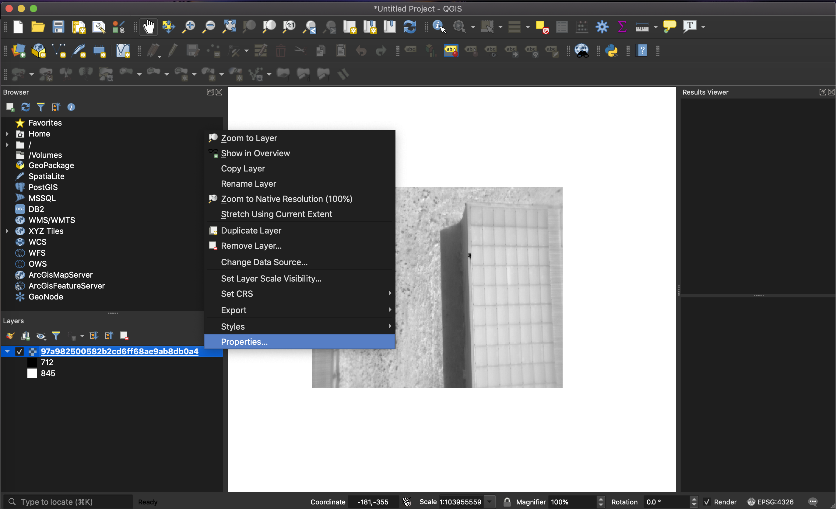
In Properties on left menu bar, navigate to Symbology as shown below.
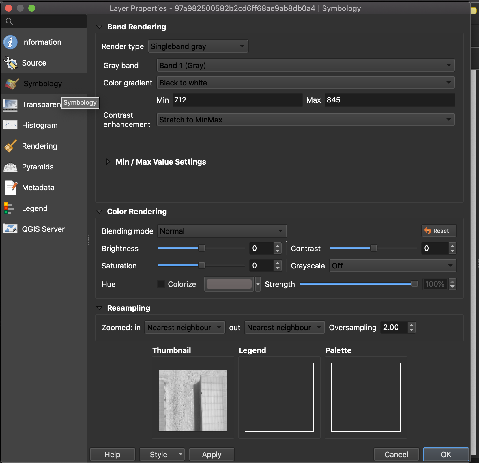
From here you will need to change the following parameters:
Render type to Singleband pseudocolor
Band to Band 1 (Gray)
Colour ramp to Magma (or your desired colour scale).
Next you will need to navigate to Histogram on the menu bar on the left which will show you the distribution of data on the layer.
Calculate histogram
Zoom in to Band 1 (red line) with the magnifying glass to define the min-max limits. Here you want to get the select the main 'peak' shown in the histogram.
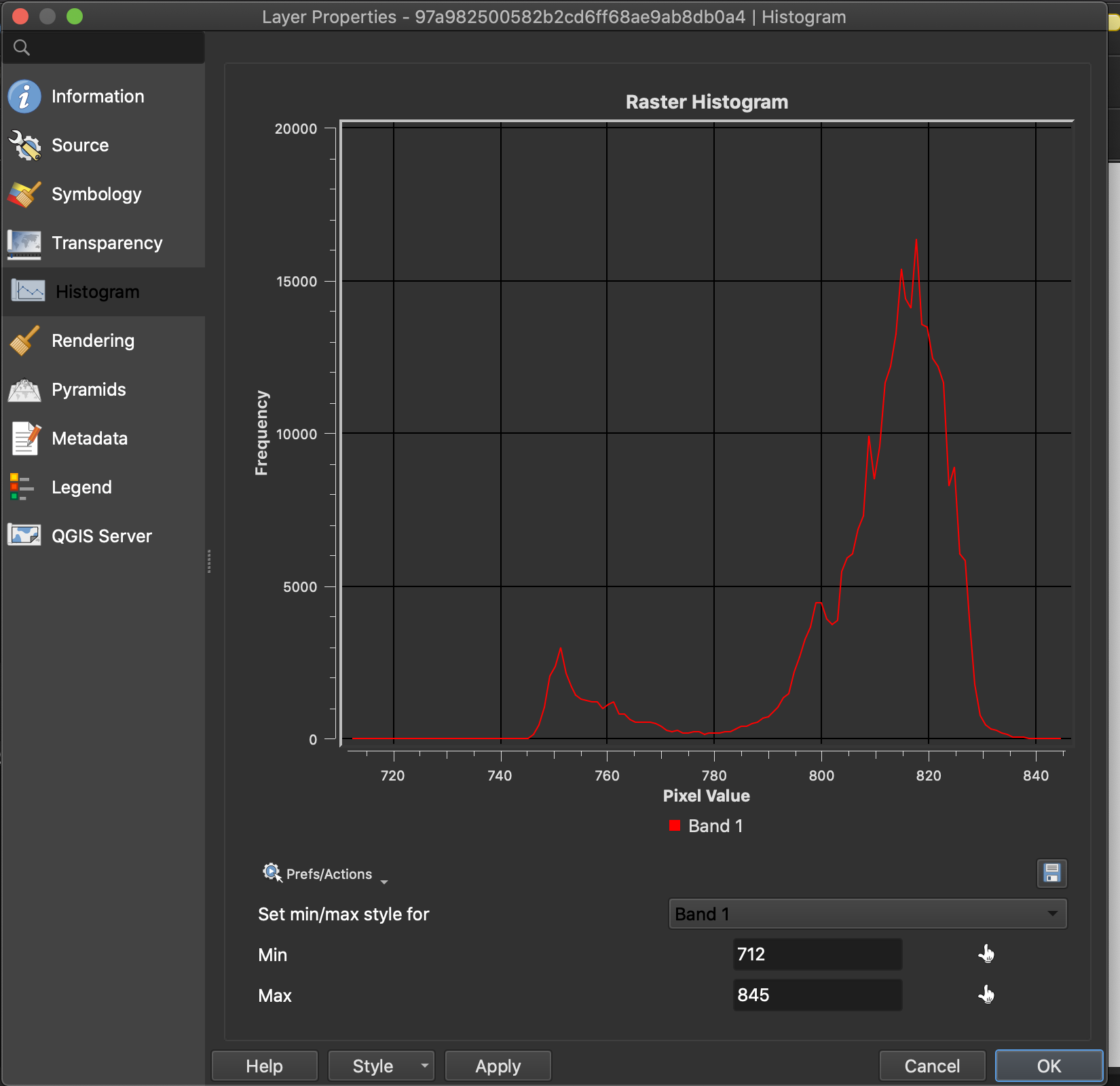
Note down the min & max values shown on the x-axis and then enter those values in Symbology Min – Max (Limits can be adjusted to each ones preference.
Finally, click on Apply or OK and your thermal orthomosaic is ready.